







CMYK or Pantone? Why Your Brand Colour Shifts in Print
A brand colour that will not hold on press is the single most argued-about subject in printing. The logo looks right on screen, it came out right in last year's catalogue, but on this brochure it is slightly flat or has drifted towards purple. The first explanation that comes to mind is that the printer did a poor job; in most cases, though, the problem is not in the printing but in how the colour was specified. Calling something "our corporate blue" is not a specification: unless you state by which method, on which stock and within which tolerance it is to be produced, every print run will give a slightly different result.
Two Different Ways of Producing a Colour
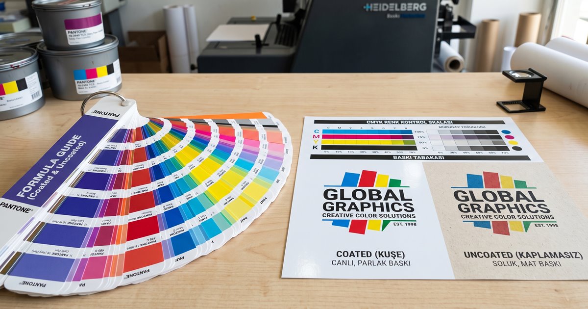
Process printing, that is CMYK, uses four inks: cyan, magenta, yellow and black. Every intermediate colour is built from tiny halftone dots of those four printed over one another; beyond a certain distance the eye cannot resolve the dots and reads them as a single colour. In other words, an orange area contains no orange ink at all — it contains magenta and yellow dots.
A spot colour — usually called a Pantone in the trade — is the exact opposite. The required colour is mixed as an ink beforehand and printed as a solid, with no halftone at all. The result is untouched by the whims of the screen, by misregistration between units or by dot gain. The price is a dedicated unit on the press and a dedicated plate.
| Criterion | CMYK (process) | Pantone (spot) |
|---|---|---|
| How the colour is formed | A mix of halftone dots from four inks | A single pre-mixed ink printed solid |
| Repeatability | Can drift from run to run | High; the ink is mixed to a formula |
| Colour range | Limited; vivid orange, green and violet fall short | Wide, including fluorescents and metallics |
| Small type and hairlines | Misregistration is a risk | One ink, no registration problem |
| Can it print photographs | Yes, that is what it is for | No, it is for flat areas of colour |
| Cost | Fixed; four inks are running anyway | A separate plate and unit for each extra colour |
| Where it wins | Photographic, multi-colour, short-run work | Logos, corporate fields, packaging, long runs |
A Pantone number on its own is not enough
The same number has separate libraries for coated and uncoated stock, and those are different colours. The letter at the end of the code therefore matters as much as the number itself. If your specification omits the letter, you are handing that decision to the printer without realising it.
Why a Brand Colour Shifts
The shift never has a single cause; four independent factors act at the same time and their effects add up. Separating them matters, because each has a different remedy and attacking the wrong one will not fix the result.
The substrate, that is the paper
Ink is transparent; the whiteness and tone of the sheet beneath it mixes straight into the result. On a cream-toned stock every colour drifts slightly towards yellow.
Absorbency and dot gain
Uncoated paper absorbs the ink, the halftone dot spreads, and the colour goes both darker and duller. The same file prints livelier on coated stock.
Ink sequence and film thickness
In process printing the inks are laid over one another; a change in the sequence or in the ink film thickness shifts the intermediate tones.
Viewing light
The same sheet looks different under shop lighting and under daylight. If the comparison is not made under a standard light, the argument never ends.
The Same Pantone, a Different Paper: Why So Far Apart
This is the most frequent source of brand colour disputes, and it is not a fault but expected behaviour. The coating on a coated sheet stops the ink from spreading into the fibres, the ink stays on the surface and the colour reads saturated. Uncoated paper draws that same ink in; the colour both lightens and greys off. The gap is most striking in vivid, saturated tones — corporate reds and oranges are the family most affected. If you want the physical reason behind that difference in more detail, our guide to paper weight and types covers it.
Delta E: Turning the Word "Close" into a Number
As long as the line between "the colour held" and "the colour did not hold" is left to the eyes of the parties involved, it stays an argument. Delta E makes that line measurable by reducing the difference between two colours to a single number. Zero means the two colours are identical; the larger the number, the greater the difference. A trained eye, under ideal conditions and with the two samples side by side, can distinguish a difference of roughly one unit. The genuinely useful side of the figure is not measurement but contract: it lets you put an acceptable tolerance in writing before the job runs.
| Delta E | Perception | Acceptable for a brand colour |
|---|---|---|
| 0 – 1 | Indistinguishable even side by side | No issue |
| 1 – 2 | A trained eye notices only side by side | Acceptable |
| 2 – 3.5 | A careful eye notices even looking at one alone | Borderline; depends on the job |
| 3.5 – 5 | The difference is obvious | Usually rejected for a brand colour |
| 5 and above | Read as two separate colours | Rejected |
Put the tolerance into the order itself
The sentence "the brand colour must be maintained" means nothing. The sentence "the brand colour shall deviate by no more than 2 Delta E from the reference print, assessed under 5000 K light" gives the printer a clear target and gives you a measurable basis if a dispute arises.
When Pantone, When CMYK?
The decision is economic rather than aesthetic, and it turns on two variables: how much weight the colour carries in the brand, and the size of the run. A spot colour brings a fixed cost; on a long run that cost dissolves per unit, on a short run it raises the price of the job visibly.
| Job | Recommended method | Reason |
|---|---|---|
| Corporate packaging, long run | Pantone | The colour is the brand; the fixed cost divides across the run |
| Business cards, letterhead, envelopes | Pantone | One or two colours already suffice, no photography |
| Photographic catalogue and magazine | CMYK | Photographs require process anyway |
| Logo on a catalogue cover | CMYK + 1 Pantone | Process inside, brand colour guaranteed on the cover |
| Flyer, short run | CMYK | The extra plate cost is not recovered at this quantity |
| Metallic or fluorescent colour | Pantone | CMYK cannot produce these families at all |
| Digitally printed work | CMYK | Most digital presses have no spot colour unit |
There is also a middle route, and in practice it is the most used solution: the job runs process, with a single spot colour added for the area carrying the logo. The photographs then benefit from the flexibility of CMYK while the brand colour is protected from the whims of the halftone. A fifth colour occupies a printing unit, so the number of units on the press is worth asking about up front.
Approximating a Pantone in CMYK
On work where a spot colour cannot be run, the brand colour still has to be built in process. Pantone publishes process equivalents for exactly this purpose, and the right approach is to use those values — not to eyeball a spot colour into CMYK on screen. Even so, not every colour can be reached; some families sit entirely outside the range process printing can produce, and the best you will get there is an approximation.
- Fluorescent and neon tones: process inks have no equivalent, and even the most vivid CMYK orange stays flat beside one.
- Metallic gold and silver: the shine comes from the pigment itself and cannot be imitated with a halftone.
- Saturated orange and coral red: a mix of magenta and yellow cannot climb into that region.
- Vivid greens: a mix of cyan and yellow usually drifts slightly towards olive.
- Deep purple and navy: they grey off in process, and these two families draw the most complaints on brand colours.
How to Write a Brand Colour Specification
- The spot colour code for coated stock, written with its library letter.
- A separate spot colour code for uncoated stock; changing the letter on the same number is not enough, the equivalent must be stated in its own right.
- The CMYK equivalent for work where a spot colour cannot be run, given as four channel percentages.
- The RGB and hex values for screen and web, kept on a separate line from the print values so the two are never confused.
- The acceptable Delta E tolerance and the light under which the measurement is to be made.
- The backgrounds the colour may sit on or under, and which version of the logo is used on a dark ground.
Get one press proof made and keep it as the reference
Numbers do not end an argument; a physical sample does. Have your brand colour printed and approved once under real press conditions, and that sheet becomes the reference for every job after it. Even when you change printers, what you hold is not a specification but evidence.
Conclusion
The choice between CMYK and Pantone is not a ranking of quality but two answers to two different problems. Printing photographs requires process; guaranteeing that one colour comes out identical on every run requires a spot. The real reason a brand colour shifts is usually not the wrong method but an incomplete specification: the stock was never named, the tolerance was never written down, the uncoated equivalent was never considered. Completing the specification is cheaper than any argument held after the job has printed.
