

Paper Weight and Types Guide: The Differences Between Coated, Bristol, Kraft and Ivory
Most of the decisions that shape how a printed job feels in the hand are made before the design file is even opened. Paper choice comes first among them: the same artwork printed on 115 gsm gloss coated reads as a cheap flyer, while on 300 gsm ivory board it reads as an invitation. Even so, the weight field on an order form is usually filled in on the assumption that higher is better. This guide explains what paper weight actually measures, why it is not the same thing as thickness, and which of the four common paper types is right for which job, with concrete numbers.
What Is Paper Weight? The Meaning of Grams per Square Metre
Paper weight is the weight in grams of one square metre of the sheet, written as g/m² or gsm. The definition is more useful than it looks, because it reduces every paper size to a single number. An A4 sheet measures 0.21 × 0.297 = 0.06237 m². From there, an A4 sheet of 80 gsm weighs 0.06237 × 80 = 4.99 grams, and a ream of 500 sheets comes to roughly 2.5 kilograms.
That calculation also explains why weight is a cost item and not only a quality indicator. Paper is bought by the tonne and shipping is priced by weight. On a 10,000-piece A4 job, raising the weight by just 1 gsm adds 624 grams to the total; moving from 115 gsm to 170 gsm on the same job creates a difference of 34 kilograms. A heavier sheet that does not deliver the stiffness the job actually needs is an expense the recipient never notices.
Weight is not thickness
This is the most common misunderstanding. Grammage measures weight, not thickness. Of two sheets both rated 300 gsm, one can be noticeably thicker than the other; the difference comes from the bulk of the paper.
Bulk: Same Weight, Different Thickness
Bulk is the ratio of a sheet's thickness to its weight. Because coating fills the pores and compresses the surface, coated papers are low in bulk: heavy but thin. Uncoated, high-bulk stocks such as ivory do the opposite and stand visibly thicker at the same weight. What matters in practice is this: whether a box holds its shape, whether a fold cracks and whether an envelope feeds through a machine is determined by thickness, not by weight. On critical jobs, ask for the caliper in microns alongside the gsm figure.
| Weight (gsm) | Character | Typical use |
|---|---|---|
| 60–80 | Thin and flexible, shows through | Book text pages, letterhead, invoices |
| 90–130 | Substantial but still flexible | Flyers, magazine pages, catalogue interiors |
| 135–170 | Semi-rigid, folds cleanly | Folded brochures, posters, magazine covers |
| 200–250 | The boundary between paper and board | Postcards, menus, folder covers |
| 250–350 | Rigid, requires creasing before folding | Business cards, invitations, cartons |
| 350 and above | Heavy board | Packaging, hard covers, hang tags |
Coated Paper: What the Coating Buys and What It Costs
Coated paper carries a mineral layer over its surface. That layer stops ink from spreading between the fibres; because the ink stays on top, dot gain drops and colours print saturated and sharp. This is why coated stock is the default for anything photographic. The cost of the coating is the loss of absorbency: ink does not sink into the sheet, it dries on it.
- Gloss coated gives the most saturated colour of any surface; it wins on photographic catalogues, posters and packaging.
- Matt coated does not reflect; it noticeably improves legibility in magazines and booklets carrying long text.
- A gloss surface shows fingerprints and scuffs; for work that passes through many hands, matt is more forgiving.
- Silk coated sits between the two: livelier than matt, less reflective than gloss.
- Ink dries more slowly on a matt surface; on jobs with heavy ink coverage, plan for varnish or additional drying time.
Bristol and Board: The Logic of a Layered Structure
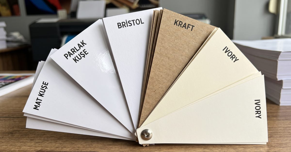
Bristol and folding boxboard are made by pressing thin layers together rather than casting one thick sheet. That structure delivers the same stiffness with less raw material and a flatter surface. The most common form in packaging is coated on one side: the printing face behaves like coated stock while the reverse stays uncoated. Whether that reverse should be white or grey is a separate decision — if the inside of the box is visible when opened, choose the white-lined grade; otherwise the grey back is both cheaper and sufficient.
Kraft: Choosing the Unrefined Look on Purpose
Kraft takes its name from its pulping process, and its long fibres give it the highest tear resistance per unit of weight of any common paper. That is the technical reason it dominates paper bags, carriers and outer packaging; its natural brown tone has since become an aesthetic choice in its own right. Bleached white kraft also exists, but in the trade the word usually refers to the unbleached grade.
Set colour expectations for kraft before you start
CMYK printing assumes a white substrate underneath. The brown ground of kraft breaks that assumption: yellow almost disappears, light tones go muddy and blue shifts towards green. The answer is either an opaque white underprint or a design built around one or two Pantone colours. Four-colour photography on kraft will land a long way from what you saw on screen.
Ivory: High-Bulk Board in a Cream Tone
Ivory is an uncoated but smooth, slightly cream-toned, high-bulk board. It stands noticeably thicker than coated stock of the same weight, and the hand registers that difference on first contact. This is why it leads on business cards, invitations and certificates, where touch is part of the buying decision. Its cream tone is easy on the eye over long reading, so it is also common for book text pages. Its weakness is photography: the uncoated surface absorbs ink, so colours never reach the saturation of a coated sheet.
The Four Papers Side by Side
| Property | Coated | Bristol / Board | Kraft | Ivory |
|---|---|---|---|---|
| Surface | Coated, smooth | Usually coated one side | Uncoated, textured | Uncoated, smooth |
| Colour saturation | Very high | High on the coated face | Low, blends with the ground | Medium |
| Bulk | Low | Medium | Medium–high | High |
| Writing on it | Difficult | Limited | Easy | Easy |
| Typical weight | 90–350 gsm | 200–400 gsm | 70–300 gsm | 200–350 gsm |
| Strongest use | Catalogues, magazines, posters | Cartons, business cards, folders | Bags, natural packaging | Invitations, book text |
| Weakness | Cannot be written on, glares | Bulky and heavy to ship | Colour is unpredictable | Flat for photography |
Which Paper for Which Job?
| Job | Recommended paper | Typical weight | Reason |
|---|---|---|---|
| Flyer | Coated, matt or gloss | 115–170 gsm | Enough stiffness to hold, low unit cost |
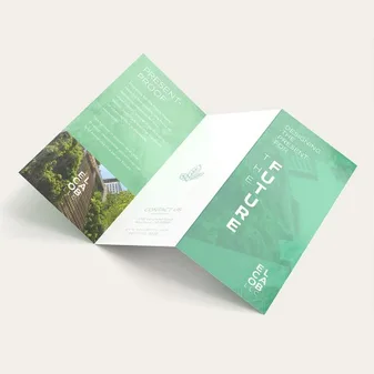
| Folded brochure | Matt coated | 135–170 gsm | Folds along the crease without cracking |
| Magazine / catalogue text | Coated | 90–135 gsm | Keeps total weight in check as pages add up |
| Catalogue cover | Coated or bristol | 200–300 gsm | Body enough to carry the inner pages |
| Business card | Bristol or ivory | 300–350 gsm | Solidity you can feel in the hand |
| Invitation | Ivory | 250–300 gsm | High bulk and a matt surface that takes ink from a pen |
| Book text pages | Ivory or uncoated woodfree | 70–90 gsm | High bulk gives a full book from a thin sheet |
| Letterhead | Uncoated woodfree | 80–100 gsm | Feeds through an office printer without trouble |
| Packaging carton | Folding boxboard / bristol | 300–400 gsm | A body that holds its shape |
| Paper bags and sacks | Kraft | 80–120 gsm | Tear resistance and a natural look |
| Poster | Gloss coated | 135–200 gsm | Colour saturation and a flat hang on the wall |
| Menu | Matt coated plus lamination | 250–300 gsm | Wipeable and durable |
Five Common Mistakes When Choosing Paper Weight
- Assuming that quality can be bought by raising the weight. A 300 gsm flyer does not look more valuable, only more expensive; if the job does not call for stiffness, nobody registers the difference.
- Choosing thick board for a job that folds, then being surprised when the crease cracks. Above 200 gsm, mechanical creasing is a requirement rather than an option.
- Deciding without handling a sample. Two brands of the same weight feel completely different in the hand, and if the bulk figure is not published, only touch will tell you.
- Ignoring the feed limits of the equipment. Envelope machines, office printers and automatic folders all have a maximum weight; exceed it and the job is finished by hand, at a cost.
- Assuming CMYK on kraft or a coloured stock will behave as it does on white. The ground colour sits under every ink layer and changes the result.
Ask for three things before you commit
An unprinted dummy, a finished sample job printed on the same stock, and a folding test if the piece will be creased. Requested together, these three surface almost every paper-related surprise before the press starts.
Conclusion
The right paper is not the heaviest one but the one that answers three questions the job itself raises: how long will it stay in someone's hands, will anyone write on it, and will it be folded? Those three answers together set both the weight range and the paper type; everything after that is budget and appearance. Deciding from a physical sample is cheaper than any fault discovered after the run.
