The Print-Ready File Checklist: Bleed, Resolution, Colour and Font Embedding
The great majority of files a printer sends back are not returned for a creative reason. The design is approved, the colours are liked, the job is ready to run — but the file is not technically ready. What is more, the reasons come from the same short list every time: no bleed, low-resolution images, colours left in RGB, missing fonts, trim marks drawn inside the artwork. This guide walks through that list in order and answers the "why" at each point, because whoever understands the reason behind a rule can bend it correctly when a job genuinely calls for an exception.
Bleed: 3 Millimetres Are Not Negotiable
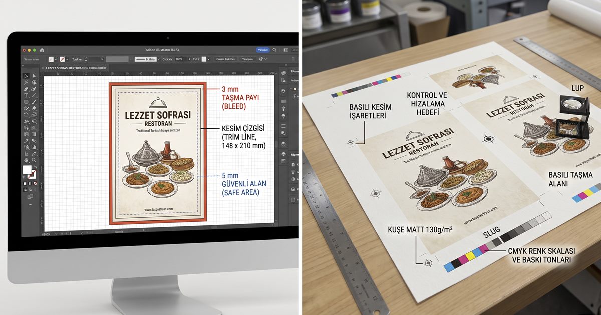
Bleed is the part of the artwork extended beyond the trim line. It exists not because a particular guillotine is imprecise but because no guillotine can be perfect: when hundreds of sheets are cut at once, sub-millimetre shifts occur within the stack. On a job without bleed, that shift shows up as a white sliver along the edge. Three millimetres guarantees that even if the cut drifts one way, the blade still lands inside the printed area.
In practice three separate lines are involved, and confusing them is the single most common mistake. The trim line is the finished size of the job. The bleed line sits 3 mm outside it, and every element that runs to the edge — background, photograph, colour block — must be extended that far. The safe area sits 3 to 5 mm inside the trim line; text, logos and anything that cannot be allowed to get cut must stay within it.
| Line | Where it sits | What goes there | Typical value |
|---|---|---|---|
| Bleed | Outside the trim | Background, photos, colour blocks — anything running to the edge is extended | 3 mm (5 mm on large formats) |
| Trim | The finished size | Nothing; this is only where the blade will land | The advertised size of the job |
| Safe area | Inside the trim | Text, logos, page numbers, anything that must not be cut | 3–5 mm (more on bound work) |
Do not create bleed by enlarging the artwork
A common shortcut is to scale a finished design to 102% and call the overhang bleed. This breaks the size of the job and every internal measurement with it: type sizes change, margins lose their symmetry, and on multi-page work the pagination drifts. The correct route is to set the document up with bleed from the start, or to extend the background elements individually past the edge.
Resolution: Where the 300 dpi Rule Comes From
300 dpi is not an arbitrary number; it follows from the screen ruling of offset printing. Quality offset typically runs at 150 lpi (lines per inch), and reproducing a halftone dot cleanly requires roughly twice as many pixels as there are screen lines. 150 × 2 = 300. The rule is therefore a consequence of the press's halftone structure, not of the paper or of the eye. Change the screen ruling and the required resolution changes with it.
For that reason 300 dpi is not the right target for every job. The second deciding factor is viewing distance: a business card is read from 25 cm, a shop-window poster from two metres, a building wrap from thirty. As distance grows the detail the eye can resolve falls away, and surplus resolution only inflates the file. Preparing a five-metre banner at 300 dpi achieves nothing except a file too large to process.
| Job | Typical viewing distance | Target resolution |
|---|---|---|
| Business card, invitation, book pages | 25–40 cm | 300 dpi |
| Brochure, catalogue, magazine | 30–50 cm | 300 dpi |
| Poster (indoor) | 1–2 m | 150–200 dpi |
| Shop-window poster, roll-up | 2–3 m | 120–150 dpi |
| Banner, building wrap | 10 m and beyond | 50–72 dpi |
Colour: What Is Lost Going from RGB to CMYK
A screen emits light; paper reflects it. That physical difference means the set of colours a display can produce is wider than the set a press can. During conversion, colours outside the printable set are pulled to their nearest reproducible equivalent; the process is unavoidable and the only real question is who performs it — you, or the printer's system. Choosing the former means seeing the result and being able to intervene before the job runs.
- Bright orange and neon green: they cannot hold their on-screen vibrancy and drop to a muted tone. If they are critical, plan them as Pantone spot colours.
- Saturated blue: tends to shift towards purple, and on a corporate blue that shift affects brand recognition directly.
- Solid black text: should print as K100 only. Black built from four inks risks misregistration at small sizes and blurs the letterforms.
- Large black areas: K100 alone looks washed out and needs a rich black build (a recipe such as C60 M40 Y40 K100).
- Light greys: tints below 5% can disappear entirely on press, so keep critical grey values above roughly 8%.
Ask for the total ink limit
The sum of the four channel percentages is called total ink coverage, and every paper-and-press combination has a ceiling; around 300% is common for coated offset and far lower for newsprint. Exceed it and the ink will not dry, transfers to the sheet behind and the job sets off. Find out your printer's limit before you settle on a rich black recipe.
Fonts: Embed or Convert to Outlines?
A font reference inside a file does not mean the font travels with it. If the same typeface is not installed on the printer's machine, the application silently substitutes a fallback; line lengths change, the layout shifts, and this is usually noticed after the job has been printed. There are two solutions, both valid, but with different consequences.
| Criterion | Embedding | Outlines |
|---|---|---|
| What the text becomes | It stays as text | It becomes vector shapes |
| Later corrections | Possible — a typo can be fixed before press | Not possible; the letters must be redrawn |
| File size | Small | Noticeably larger on text-heavy work |
| Small-size quality | Hinting is preserved, small type stays cleaner | Hinting is lost; very small type can thin out |
| Licence risk | Some fonts do not permit embedding | None |
| When to choose it | The default route; PDF/X already requires embedding | When a licence blocks embedding, or for one-off items such as a logo |
Easily Missed Details: Hairlines, Small Type, Overprint
Three things that look fine on screen disappear in print. The first is very fine rules: lines below 0.25 pt (about 0.09 mm) can break up in offset, and reversed out they can fill in completely. The second is small type built from several inks; below 6 pt, a four-colour setting becomes unreadable at the slightest misregistration, so a single ink is mandatory. The third is the overprint setting: if a white element has been assigned overprint by mistake it will not appear at all, because there is no white ink — whatever sits beneath it simply stays.
File Format and Delivery
PDF is the undisputed standard for print, but not every PDF is fit for it. The PDF/X family was defined for exactly this purpose: it makes font embedding mandatory, flattens transparency, fixes the colour space and defines the bleed and trim boxes inside the file itself. An ordinary PDF made for the web, by contrast, may have compressed the images, left the colours in RGB and dropped the fonts. Deliver pages individually, in reading order, with trim marks outside the artwork; imposition is the printer's job.
Bleed and trim
Is there 3 mm of bleed on every edge, are background elements extended into it, is all text inside the safe area?
Resolution
Does the effective resolution of each placed image suit the viewing distance, and are any links broken?
Colour
Is the file CMYK, is black text K100, is the total ink limit exceeded, are any spot colours named correctly?
Fonts
Is every font embedded or outlined, and has any text been silently substituted with a fallback?
Layers and overprint
Are trim and crease marks on a separate layer, and is overprint wrongly applied to any white element?
Format
Is the output PDF/X, are the pages single and in the right order, does the page size match the job exactly?
The Five Files Printers Send Back Most Often
- A file with no bleed. This is the most frequent reason for rejection, and fixing it often means rebuilding the layout, because there is no background left to extend.
- An image taken from the web. Web images are typically 72 dpi and compressed; enlarged to print size they produce no detail, only larger blur.
- A file left in RGB. The printer performs the conversion, you dislike the result, and you never get to see which colour went where.
- A missing font. The file opens at the printer with a substitute and the line breaks move; the error is usually spotted on the printed job.
- Trim and crease marks drawn into the artwork. Those lines really will print; they belong on a separate layer or in the PDF's trim box definition.
Starting from a template closes half of this list
A template prepared for the product already has the bleed, the trim line, the safe area and the page size set up correctly. Placing the design onto a template instead of building a document from scratch eliminates the three most common causes of rejection before you begin.
Conclusion
A prepress check is not about the quality of the design but about whether it can be manufactured; it is therefore a mechanical check rather than an artistic decision, and it should be run exactly as a checklist. Work through the six headings above — bleed, resolution, colour, fonts, layers, format — and almost every rejection is prevented. Five minutes of checking is cheaper, in every case, than reprinting a job that has already been on press.
